Possible Stock Market Crash This Year
Here are three charts that have me worried about a sudden stock market crash in 2017.
The first is the chart of the National Association of Active Investment Managers’ (NAAIM) Exposure Index. It shows what percentage of stocks are in active manager investment portfolios, compared to other investment holdings like cash and bonds. At the bottom of the chart, the performance of the S&P 500 index is plotted.
Advertisement

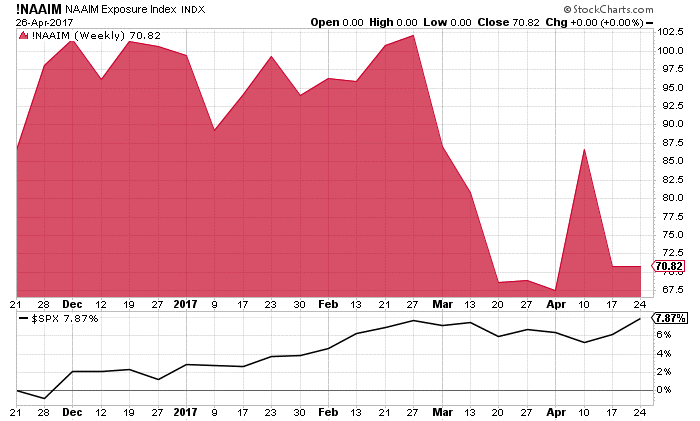
Chart courtesy of StockCharts.com
Notice how, as the S&P 500 has increased in value over the past five months, institutional investors reduced their exposure to stocks. In late February, 100% of their portfolios were in stocks. Now, it’s only 70%, which is a 30% reduction in a very short time frame.
Also Read: Stock Market Crash 2017? This Could Trigger a Stock Market Collapse
Institutional investors turning sour on stocks is negative. From what it looks like to me, as the stock market rises, institutional investors are selling into that market, as opposed to buying. Smart money selling into any market is not a good sign.
Next, let’s look at the copper-to-gold multiple. Something terrible is going on with this indicator. The red line in the chart below represents the copper-to-gold multiple, and the green line represents the S&P 500 index.
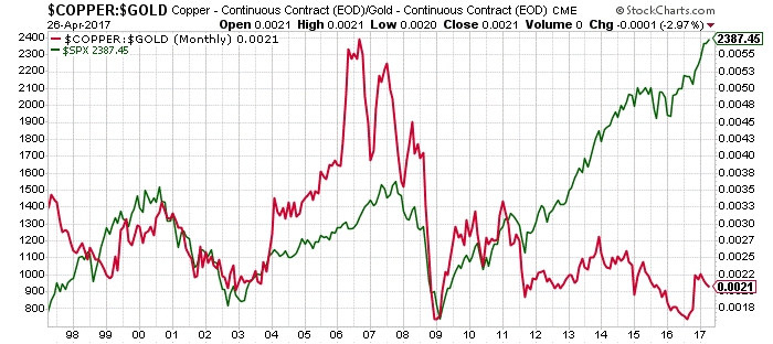
Chart courtesy of StockCharts.com
The copper-to-gold multiple has been a very powerful indicator of the stock market direction for years. As the chart above illustrates, when the copper-to-gold multiple goes up, key stock indices go higher. When it declines, stock markets go down with it.
This correlation started to unravel in 2012. Today, we have the copper-to-gold multiple falling and the S&P 500 rising. This says two things: either gold and copper are both way too cheap, or the stock market is way overpriced. I believe that both of these statements are true now.
Finally, let’s look at a chart of the number of S&P 500 stocks trading above their 200-day moving average.
The 200-day moving average is basically an indicator if a trend of a stock’s price is up or down. If a stock trades above its 200-day moving average, it’s said to be in an uptrend. If the stock trades below this moving average, it is said to be in a downtrend.
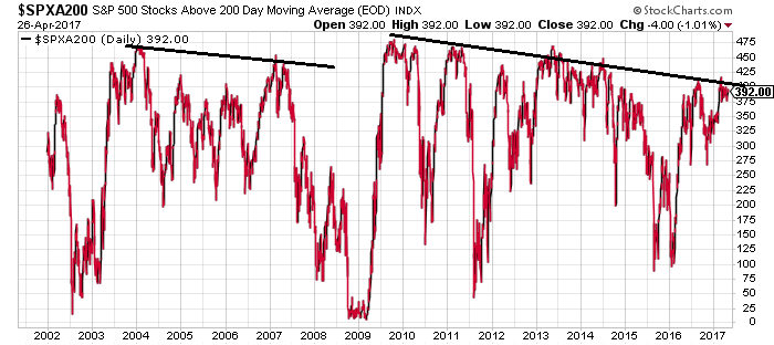
Chart courtesy of StockCharts.com
As stocks bounced off their lows after the stock market crash of 2008–2009, one would assume that a lot of stocks on the S&P 500 would be trending higher. But this is not the case.
Credits: Flickr.com/successionmedia
Since 2010, the number of stocks trading in a downtrend on the S&P 500 has increased. What’s even more intriguing: the last time something like this happened, it was prior to the stock market crash of 2008–2009.
Dear reader; 2017 could be the year when investors come to their senses and start to pay attention to the fundamentals. With stock prices at record highs, price-earnings (P/E) multiples at record highs, dividend yields at record lows, our economy sluggish, and increasing geopolitical risk, “regression to the mean” may not be far away for stocks.
As reality and panic sets in, a rigorous stock market crash often follows.