
The Future of Gold is Looking Bright
Since late 2016, gold prices have been forming a technical chart pattern called an “ascending triangle.” This pattern is formed when there’s a price uptrend, but resistance to move even higher has been encountered.
Over the last few days, gold prices have moved above that resistance level. In technical analysis terms, this is a “breakout.” You can see it on the chart below.
With every technical chart pattern, there’s usually a price target associated with it. For an ascending triangle, to find the target price, technical analysts usually calculate the widest part of the triangle and add it to the resistance level. This gives them a rough idea of where prices could go next.
With this said, if we assume the widest part of the triangle to be the price action between November and December 2016, it’s roughly $170.00-wide, from $1,300 to $1,130. So, gold prices could reach as high as $1,470 an ounce with its current advance. (That’s just for starters. I’m on record saying that gold is headed to between $2,500 and $3,000 before its run is over.)
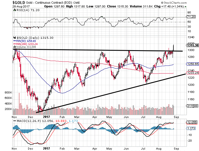
Chart courtesy of StockCharts.com
Please also take a look at this next chart below, which is longer-term in scale. The breakout in gold prices is even more defined on this chart.
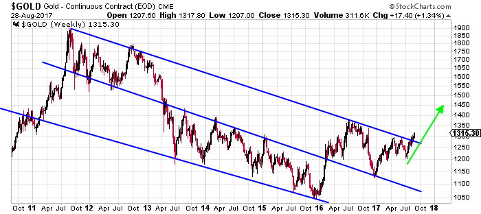
Chart courtesy of StockCharts.com
Another thing that investors should pay attention to on the chart above is the downtrend being broken. Gold prices just broke above a downtrend that was in place since late 2011. This is big and shouldn’t be ignored because, when trends break, usually a massive move follows.
Lastly, let’s look at this very long-term chart of gold prices.
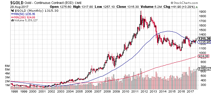
Chart courtesy of StockCharts.com
Pay attention to the 50-month moving average, the 200-month moving average, and the volume at the bottom of the chart. Currently, we see both of the moving averages below current gold prices. At its core, this says that the long-term trend continues to point upward. As they say in technical analysis, “the trend is your friend until it’s broken.”
Finally, as for volume, notice how it’s been increasing since 2016? This tells us that buyers are coming in, and that the selling pressure we saw in 2013, 2014, and 2015 may just be diminishing.
Dear reader, looking at what’s happening on the gold price charts, I can’t help but be bullish on the yellow precious metal. The outlook to me is very bullish. All year I have been pushing my readers to look at the opportunity offered by the depressed shares of gold mining companies. It’s still not too late; these shares will soar as gold prices continue their climb.